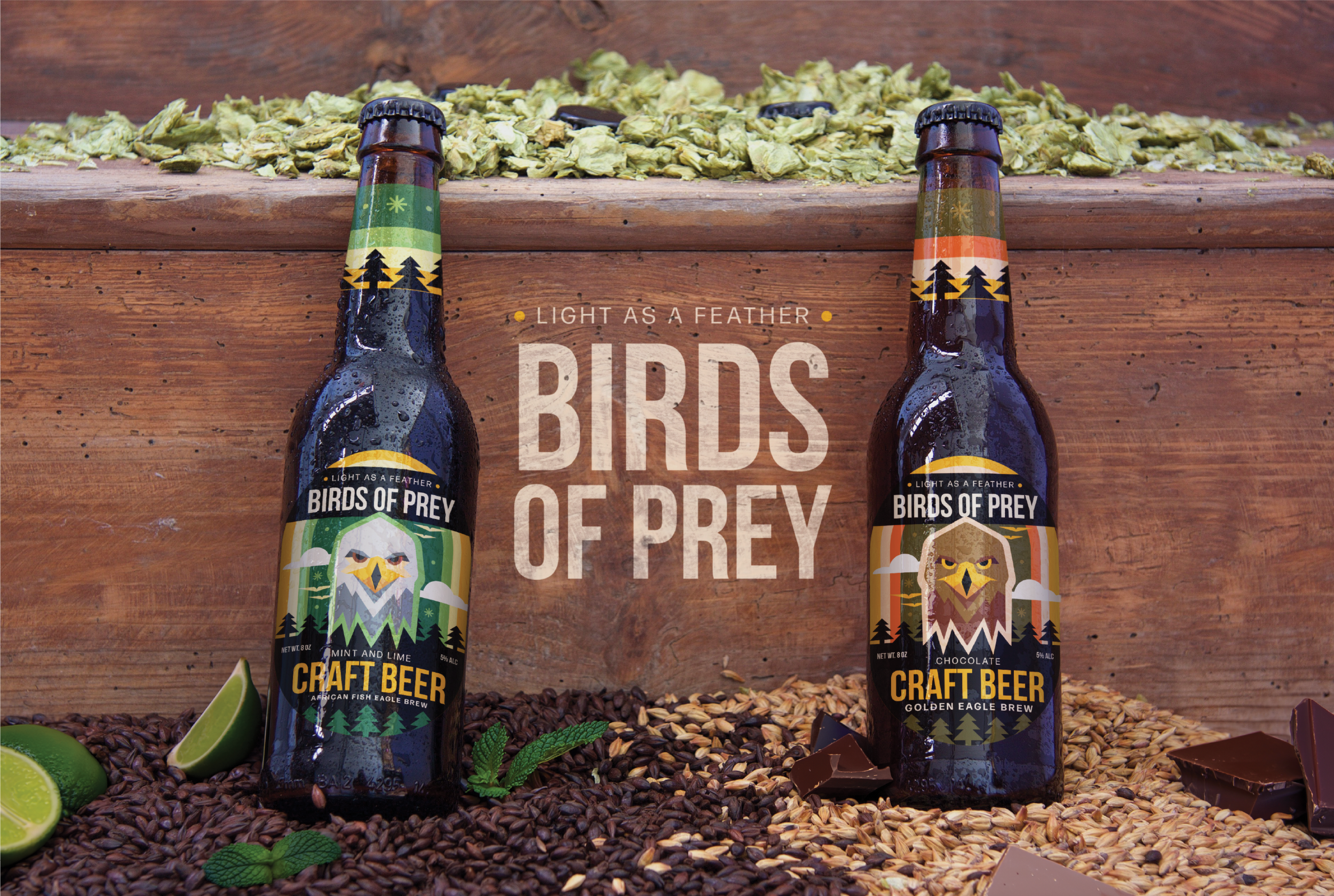
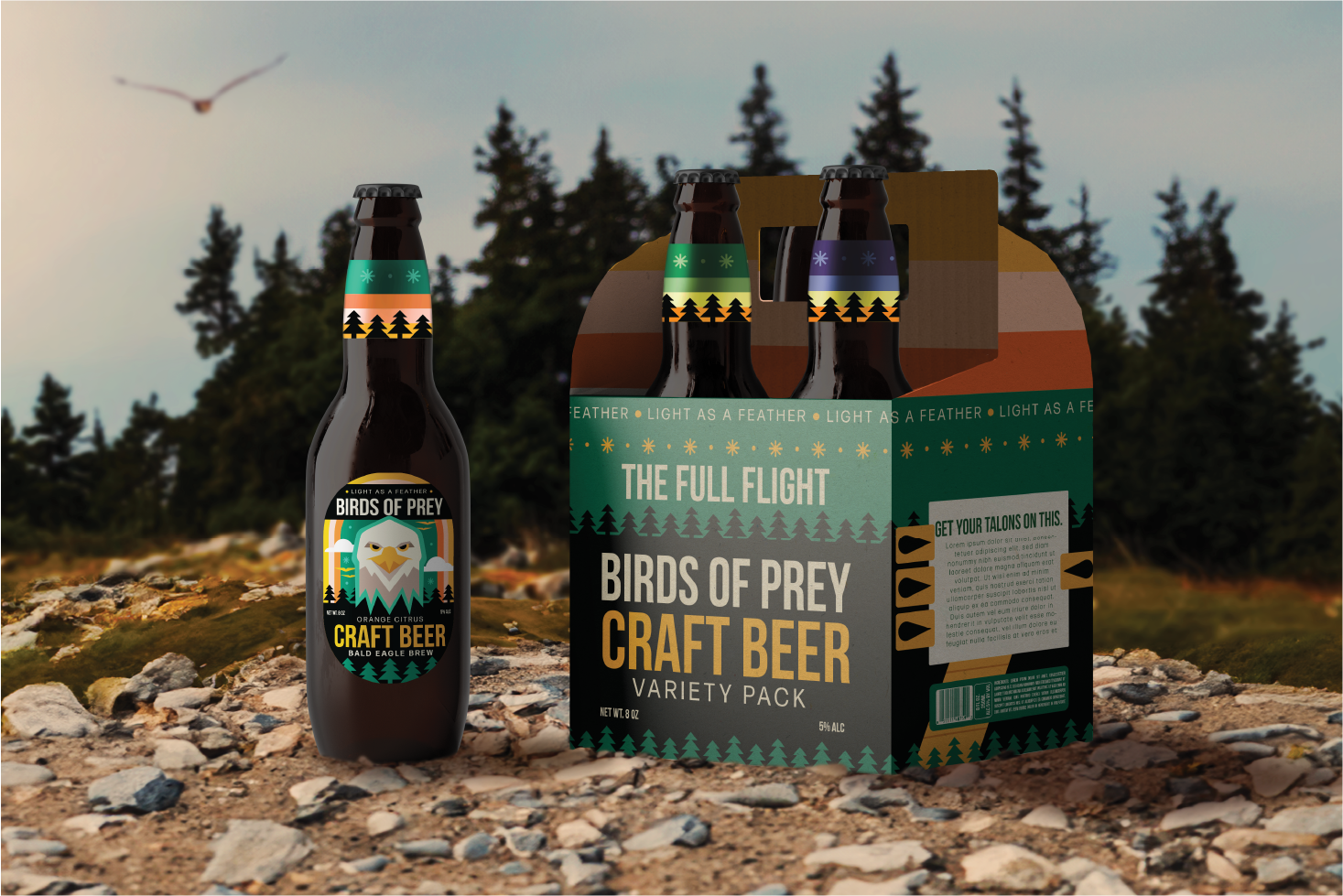
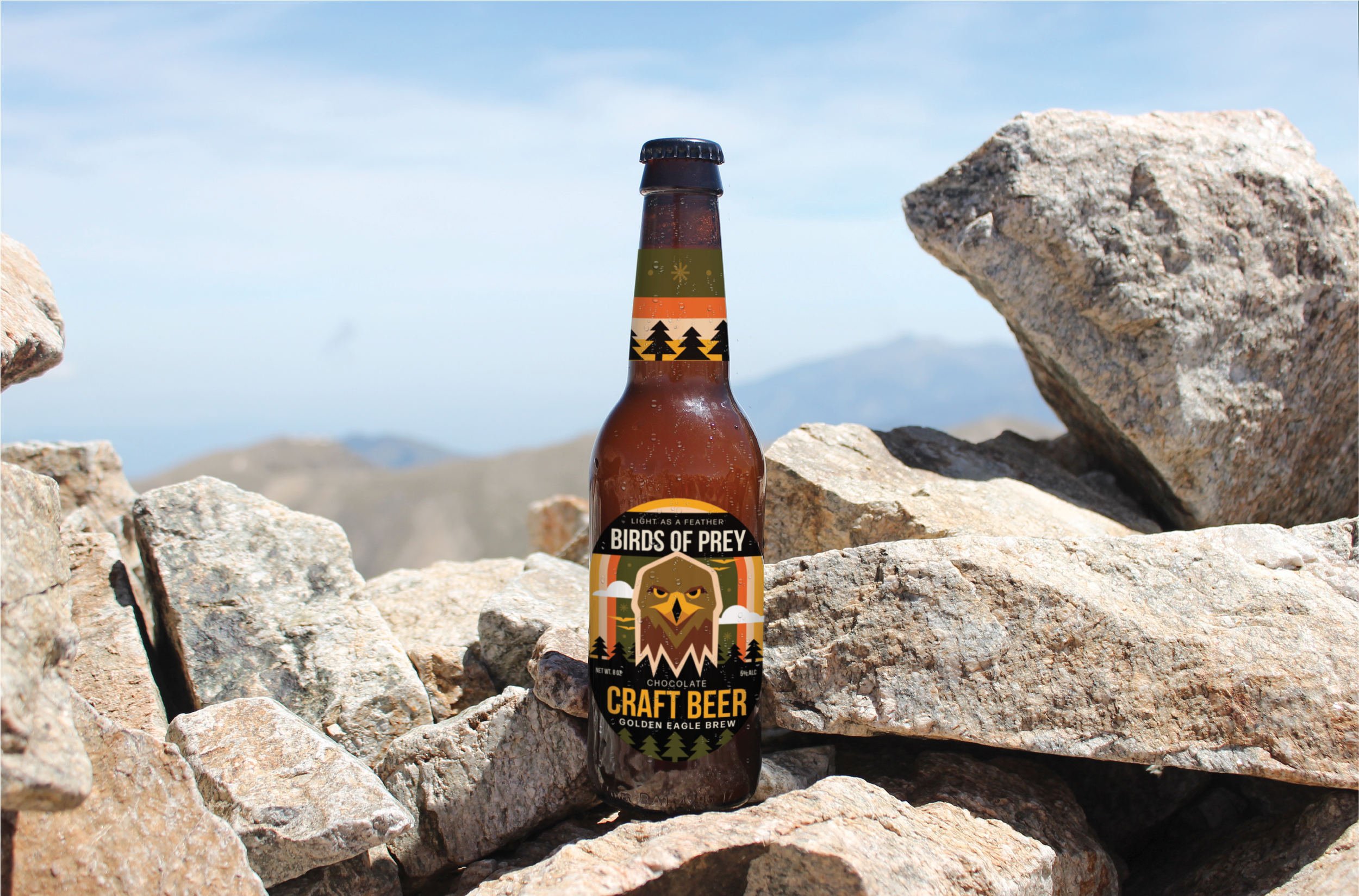
Birds of Prey
A summer breeze, a warming sun, and a need for a beverage. Birds of Prey is a beverage company that’s focused on flavor that makes you feel like you’re flying, using one of the most iconic symbols of the skies; the eagle. By using different birds to represent global flavors, the world is at your wingtips whenever you decide to have a drink.
Illustration
•
Branding
•
Packaging
•
Illustration • Branding • Packaging •
The Problem: How to show a well-organized wild side?
Illustrative, organic, and professional were all aspects that are key to the values of this brand. How do you take the wild, uncontainable aspects of nature and express them in a way that feels reliable, organized, and trustworthy? Both sides of the brand are represented – Birds of Prey’s relaxed attitude combined with the reliability of refreshment – needed to be shown in an eye-catching and interesting way.
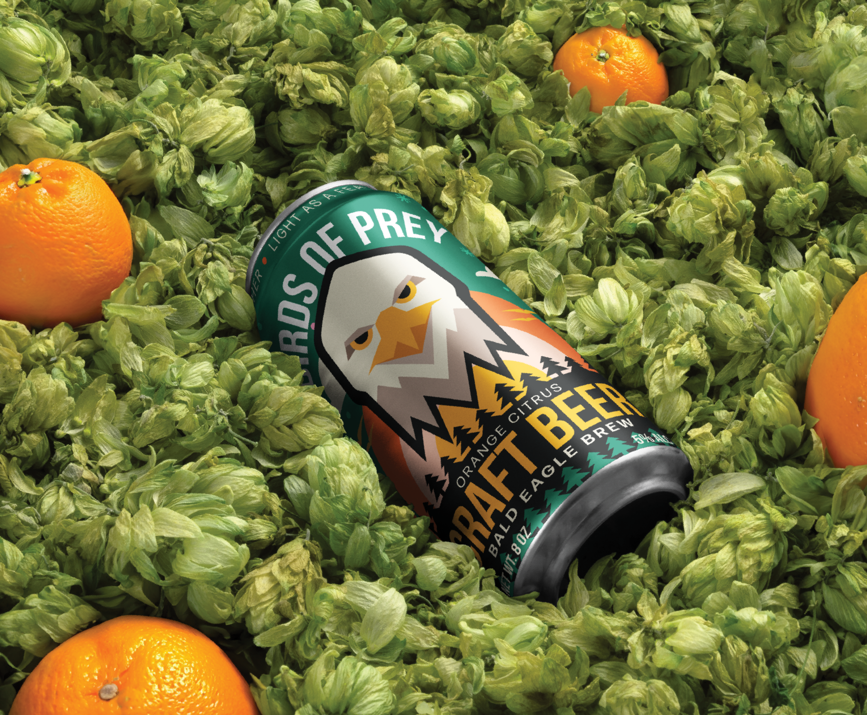
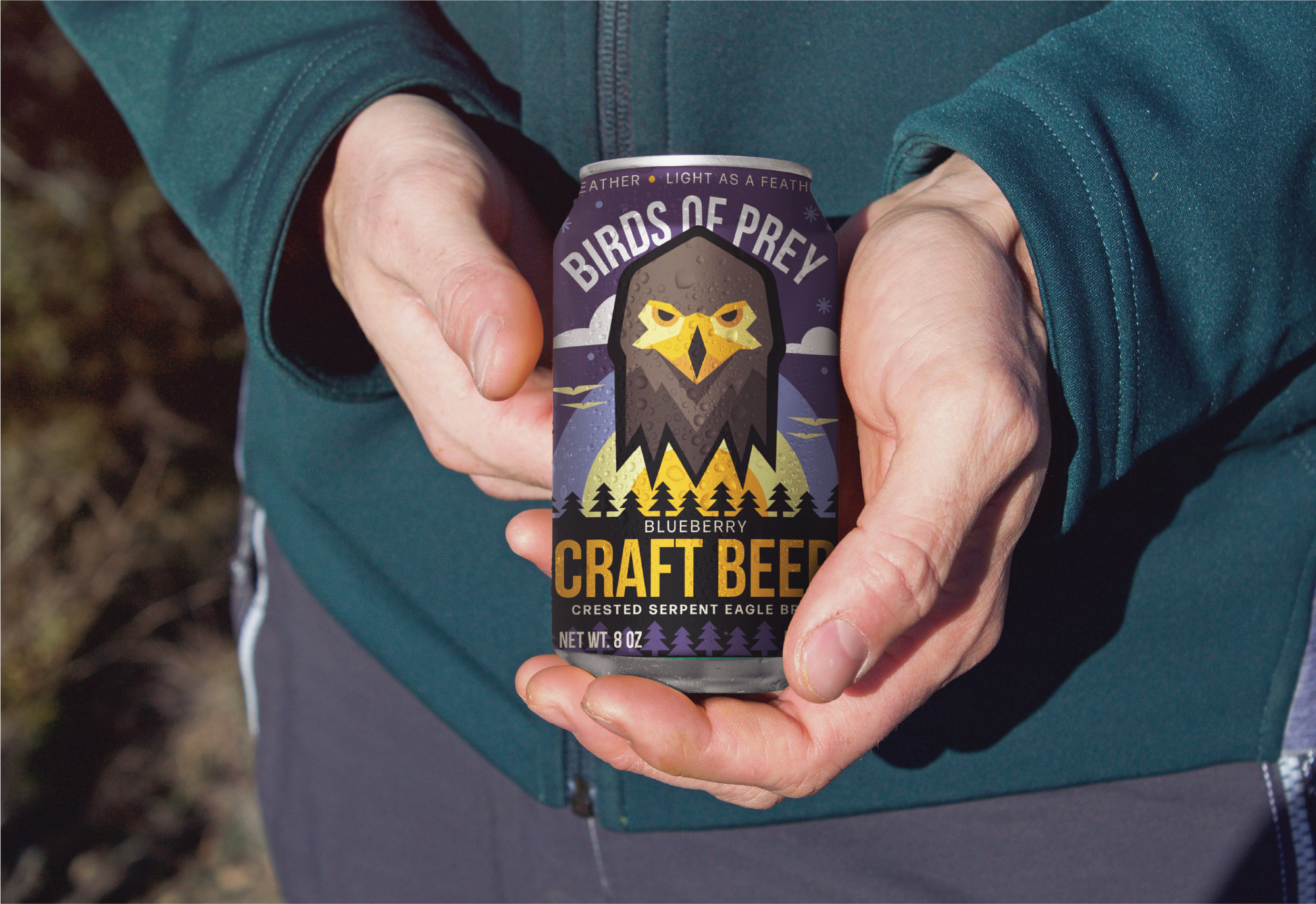
The Fix: bold, bald, and beaked.
Looking skyward for inspiration, the symbol of the eagle was chosen for its serious yet dynamic nature, and it’s global presence opening packaging and flavors to a world of variety. Using a warm and dynamic color palette, an angular and approachable illustration style, and a whole lot of flavor, Birds of Prey’s brand, packaging and project showcase it’s wistful flavors and encourage you to take a sip of the outdoors.